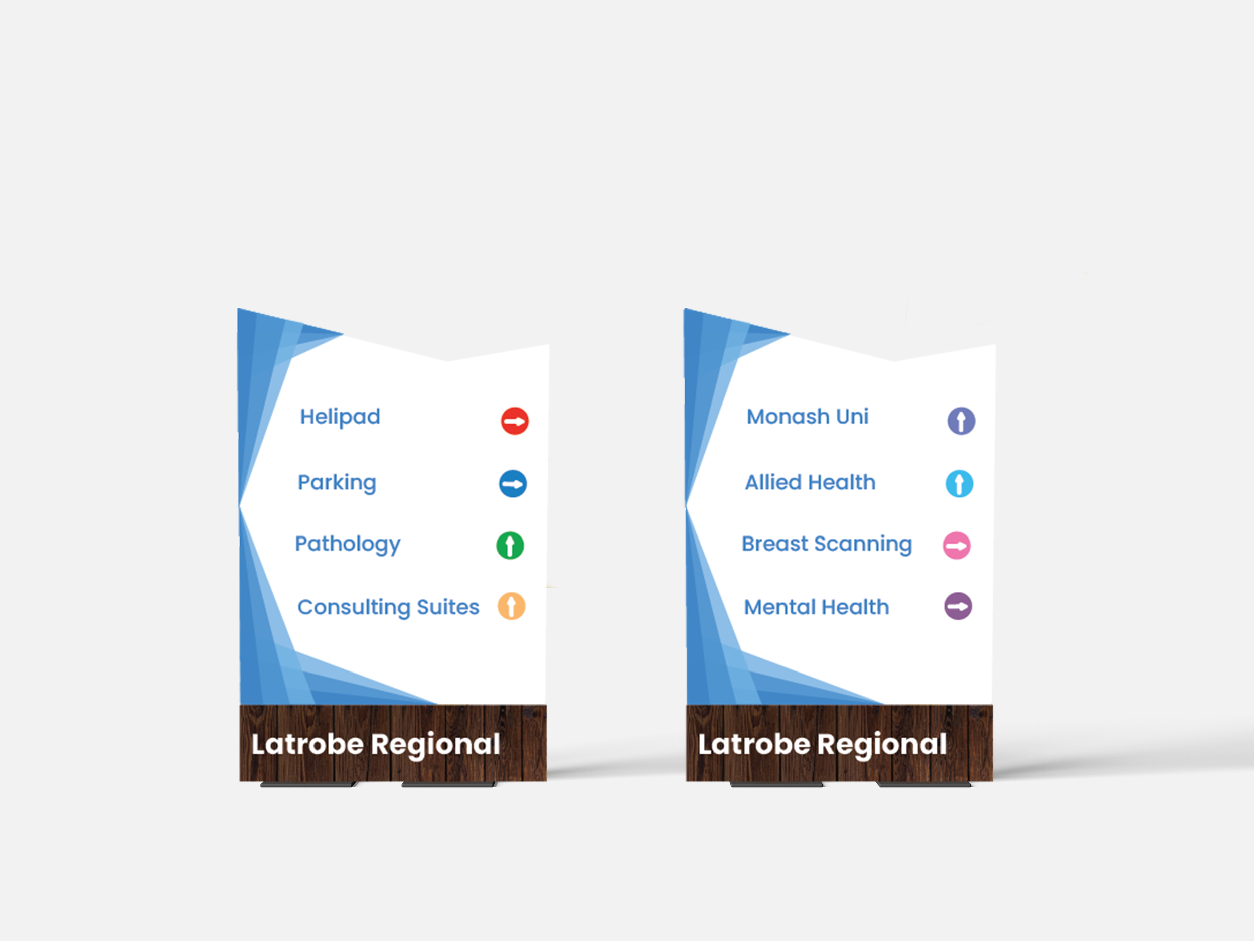
Latrobe Regional Hospital Signage


Client
The Latrobe Valley Council is focused on the development and enhancement of community facilities throughout the Latrobe Valley, including ongoing renovations at the Latrobe Valley Regional Hospital. The council's strategic aim is to ensure the region's built environment is functional, accessible, and aesthetically in line with the area's growth and environmental development.
Problem
The Latrobe Valley Regional Hospital is currently undergoing significant renovations, including expansions to its emergency wards and other facilities. However, the hospital’s existing wayfinding signage is outdated, inconsistent, and difficult to navigate. This problem was highlighted through personal experiences of confusion while trying to locate departments, as well as visitors directly asking for directions to consulting suites.
Key issues include:
Inconsistent Signage Design: Some signs used a modern sans-serif typeface, while others didn’t. Inconsistencies in colour palettes and layout were also observed.
Lack of Cohesion with Community Design: The hospital signage did not align with Latrobe Valley’s modernised welcome and goodbye signs, creating a visual disconnect between the hospital and the rest of the community.
Poor Readability and Visibility: The current signage used grey materials with blue lettering, resulting in a washed-out, low-contrast appearance that was difficult to read. The typeface and iconography lacked sufficient boldness to be legible in fast-paced hospital environments.
Navigation Issues: Due to the hospital’s growth and new renovations, the signage was insufficient to guide visitors effectively, with some areas of the hospital hard to navigate.
Role
As part of my ADD207 Environmental Design project, I took on the role of signage designer and strategist. My responsibilities included:
Conducting research on existing signage in Latrobe Valley and at the hospital
Identifying areas for improvement in both aesthetic appeal and functionality
Redesigning way finding signage that aligns with the Latrobe Valley's regional design language while also improving usability
Creating 3D mockups using Adobe Illustrator to visualise new designs
Testing colour palettes, typography, and textures to improve visibility and readability
Solution
The objective was to create a cohesive, visually appealing wayfinding system for the hospital that could seamlessly integrate with the surrounding community’s signage while enhancing navigation for all visitors.
The proposed solution included:
Consistent Use of Colours: Drawing inspiration from Latrobe Valley’s community signage, I introduced blues for calming emotions in the hospital’s general signage while using bold reds or oranges for emergency areas to highlight urgency. These colour schemes created consistency with other community signs.
Improved Readability: The final typography choice was "Microsoft Sans Serif" for its modern, clean structure that complements textured backgrounds. Font size and weight were increased for better visibility, and contrast between text and background was heightened by avoiding grey-on-blue combinations.
Material Selection: Wooden textures were incorporated into signage panels to create a natural, warm feel, harmonising with other public space designs in Latrobe Valley. Concrete textures were used as a subtle, durable backdrop for these signs.
Iconography and Site Map: Icons were redesigned for simplicity and clarity, with larger, colour-coordinated symbols to identify key areas, such as emergency exits. A site map with colour-coded buildings was introduced to help visitors quickly orient themselves.
3D Mockups and Sign Placement: To enhance user experience, 3D mockups of the redesigned signs were created. These were placed at key decision points around the hospital, such as entrances, main hallways, and emergency areas.
Outcome
This redesign aimed to improve hospital navigation by addressing the legibility and consistency issues in the current system. The new signs reflected Latrobe Valley’s identity while enhancing user experience, making it easier for visitors of all ages and abilities to find their way.